
Carapelli is known for high quality olive oils, and I was tasked with updating the European key visuals for the U.S. market. Their original graphics were a bit dated and featured the product on an old table surrounded by ingredients, some not typically found in American dishes. Initially, I created options on a lighter tan color, still featuring ingredients with a frame but in a cleaner, simpler way and further outside of their comfort zone that I knew we would end up. In the end, the final visual for this version of creative compromise was a modernized blend of their more traditional aesthetic mixed with a splash of ingredients. a work of art
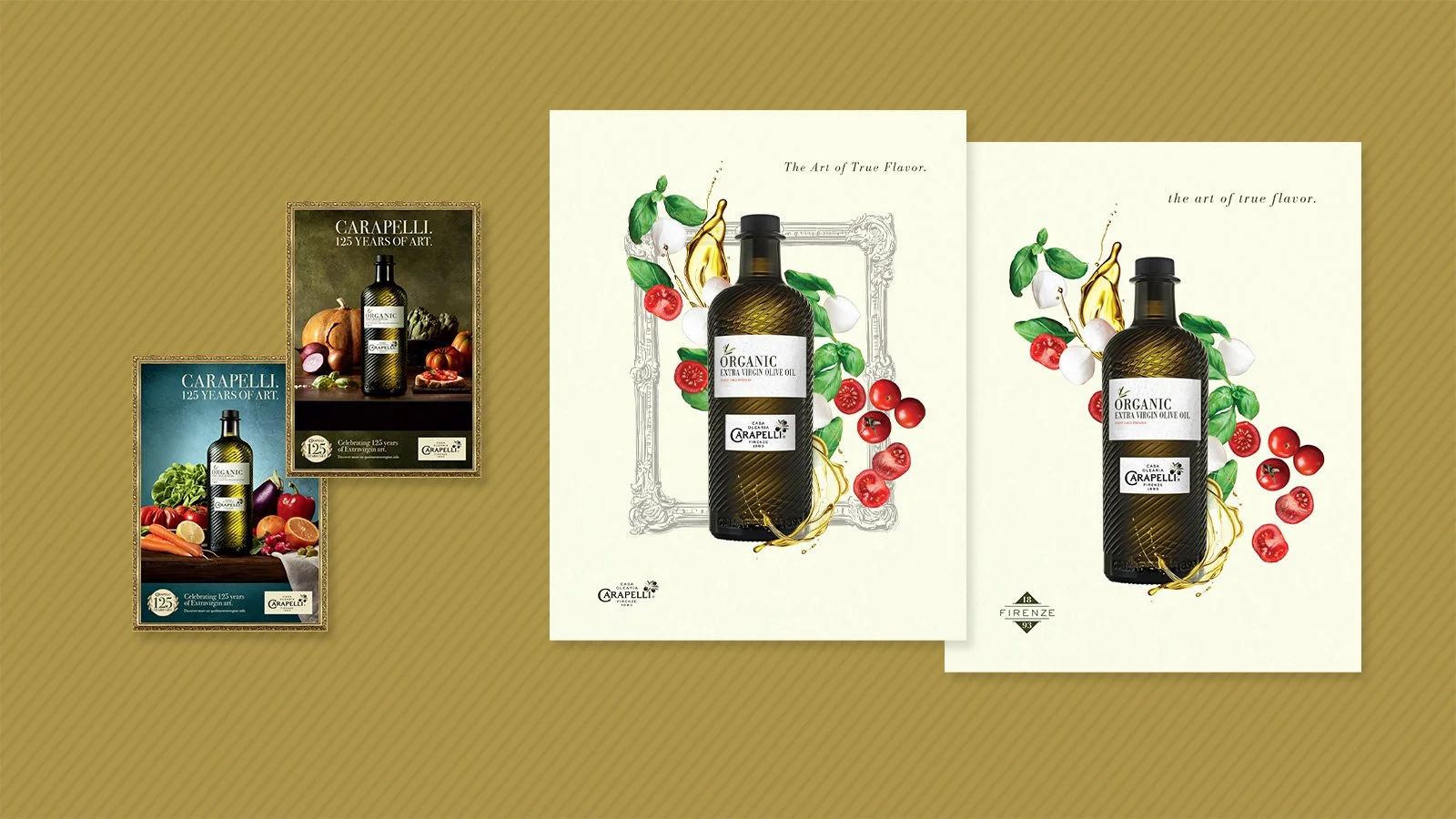
Original KVs from European client alongside updated US KV option.
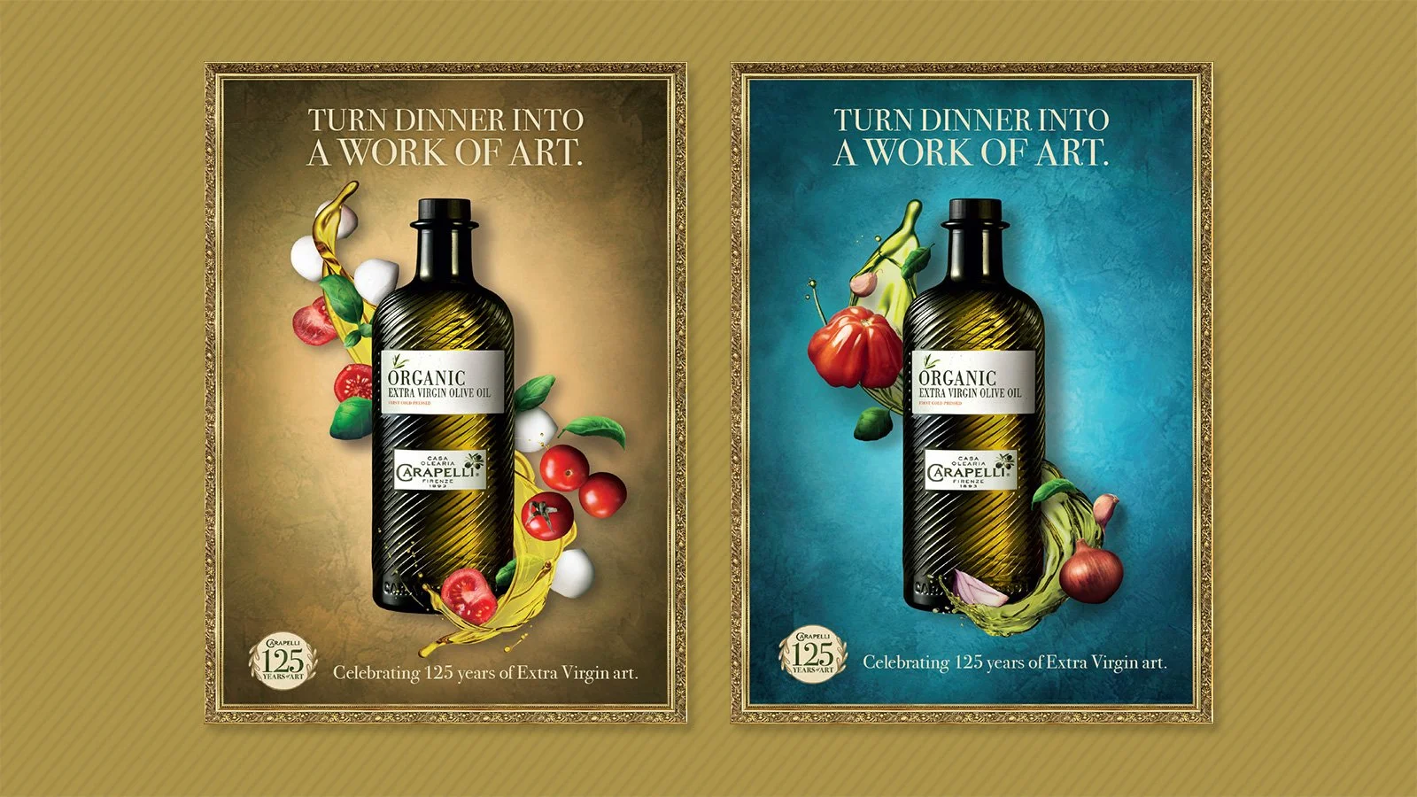
Final KV for the US market featuring a combination of our updated design aesthetic with European KV elements in the background